India Mahdavi on Cosmopolitanism, the Media, and Her Legacy
Speaking the language of colour.
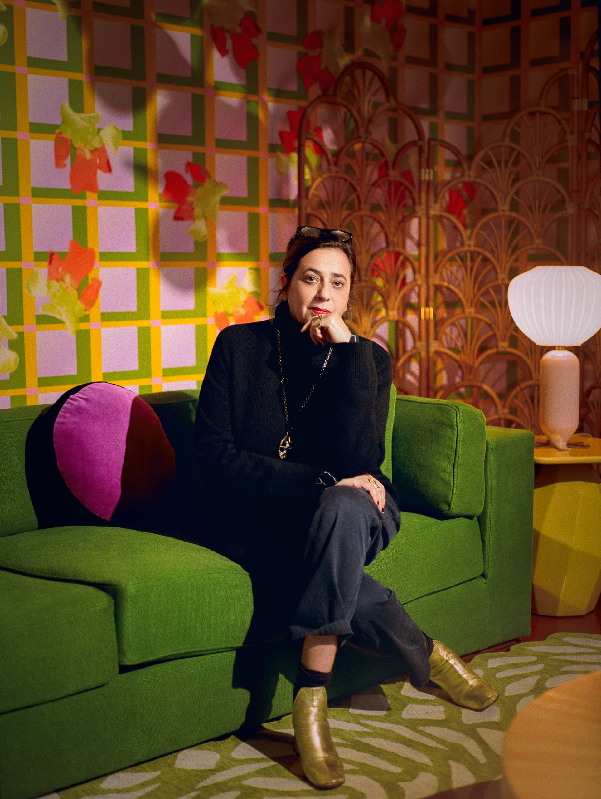
India Mahdavi is one of few people who have a forthright answer when asked to concisely define her style. But her answer, like her work, contains multitudes.
“Polyglot and polychrome,” says the 58-year-old interior designer and architect, and there is a wryness to her response, as if she knows that in answering, she has opened up more questions. But she explains, “Polychrome because you never get enough colour, and polyglot because my style is not international but cosmopolite.” The magnetism of Mahdavi’s designs can be found in each of these words, but it is in the relationship between them where the almost magical core of her work takes form. The use of bright colours, mixed materials, and oblong shapes speaks to her bevy of inspirations, from Iranian culture to cartoons. Almost unclassifiable, her work relies not on identity nor taxonomy but on emotion and worldly experience.
Mahdavi’s international upbringing is well cited. Born in Iran, she lived as a youth in the United States and Germany before landing in the South of France. The collective experiences contributed to her “cosmopolite” style that blends rather than collages the many influences. From her Paris workshop, Mahdavi wields these experiences. “I would like to be remembered as someone who envisioned my profession as multidisciplinary from the various mediums I convene to the different scales and the many locations,” she says.
Design, like any other medium, tells its own story; it brings participants and creators into a world of sense and structure that dictates a metaphysical language. With hues that are almost unbelievable, Mahdavi speaks this language in her own unique register, one that developed during her time studying architecture at the École des Beaux-Arts in Paris and as creative director of Christian Liaigre before starting her own studio in 1999.
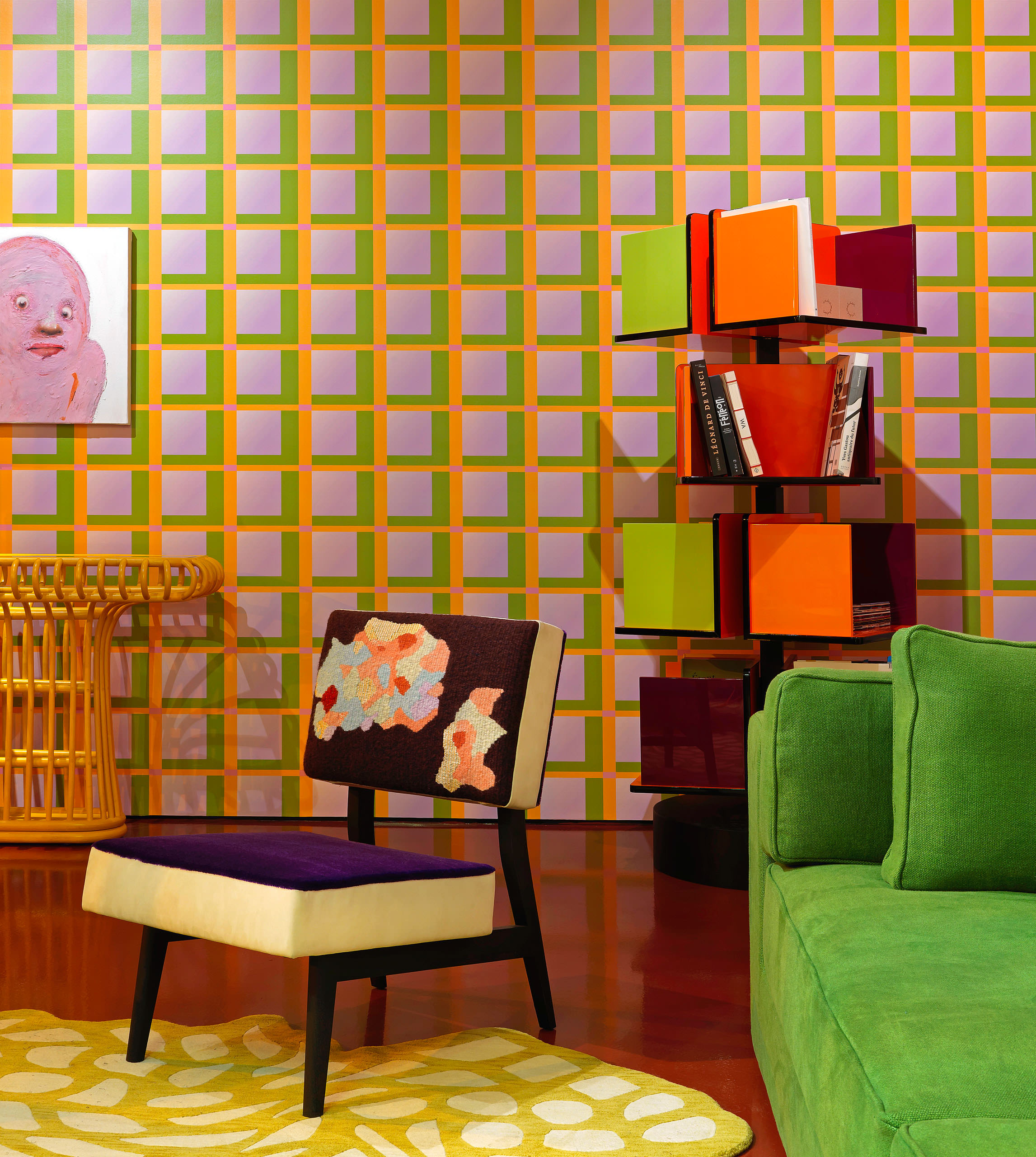
Bright colours and mixed materials speak to India Mahdavi’s bevy of inspirations, from Iranian culture to cartoons. For her project rooms (Project Room #3 pictured), she creates a set in a space near her gallery in Paris, on rue de Bellechasse, filled with her own pieces alongside those of her collaborators. Photo by Thierry Depagne.
Besides Mahdavi’s Diogenic approach to her origins, her designs’ success on Instagram is perhaps the most reported thing about her—the social media success of her eye-grabbing design of the Gallery at Sketch in London, for example. Photos of the tailored Charlotte armchairs in rose quartz that line the bubbly room have made their way into countless feeds and lists, and the restaurant became a place people travel to just for the coveted geotag. Despite this, Mahdavi says that “I haven’t let social media influence the way I work. I always created photogenic spaces because of my cinematographic aspirations and have trained my eye to work like a camera.”
Perhaps the success of Mahdavi’s designs has been due to the social nature of some of her biggest projects. Lounges and clubs, such as Chez Nina in Milan, fill her portfolio, each one different from the last. The designs are attractive because they are both silly and serious, sharp and sweet. Her use of repeating pattern immerses the habitués in a holistic vision, a technicolour dream, while the arrangement of space recalls specific socially oriented spaces that almost beg to be occupied by interesting people. These imaginary aesthetes bend the rules while having the utmost knowledge of them, much like Mahdavi herself.
“I believe that a symmetrical space can benefit from an asymmetrical arrangement,” she says. “It’s like a game. But I have a preference for false symmetry: it’s less obvious.” The game is something that draws together her style. There is a joyousness, a wise, youthful triumph to it. Simply put, her spaces are fun.
“I’m excited about colours that are not defined: the colours of uncertainty. Today nothing can be defined clearly—we can’t see what the future is made of. So, if I had to choose a colour that defines our times, it would be milky and watered-down.”
—India Mahdavi
Mahdavi’s social expressions go beyond the genre of the rooms she designs. Her collaborations are far reaching, from the Objets Nomades collection with Louis Vuitton to textiles and decorative designs for Monoprix. But “more than collaborations, I value human encounters,” she says.
One such encounter was in Siwa, Egypt—a small desert town in the eastern Sahara. There, Mahdavi helped design an oasis-like home for Dr. Mounir Neamatalla, a pioneer in eco-tourism. “It was a fascinating experience to modernize the vernacular architecture built in kershef, a material that combines salt, rock, and mud—and to model a building like a sculpture, free of the plan and full of possibilities. I explored the qualities of the local resources (salt, palm tree, and sandstone) to their limit. Notably, I created the first line of objects in salt that inspired a small local industry,” she says about the endeavour.
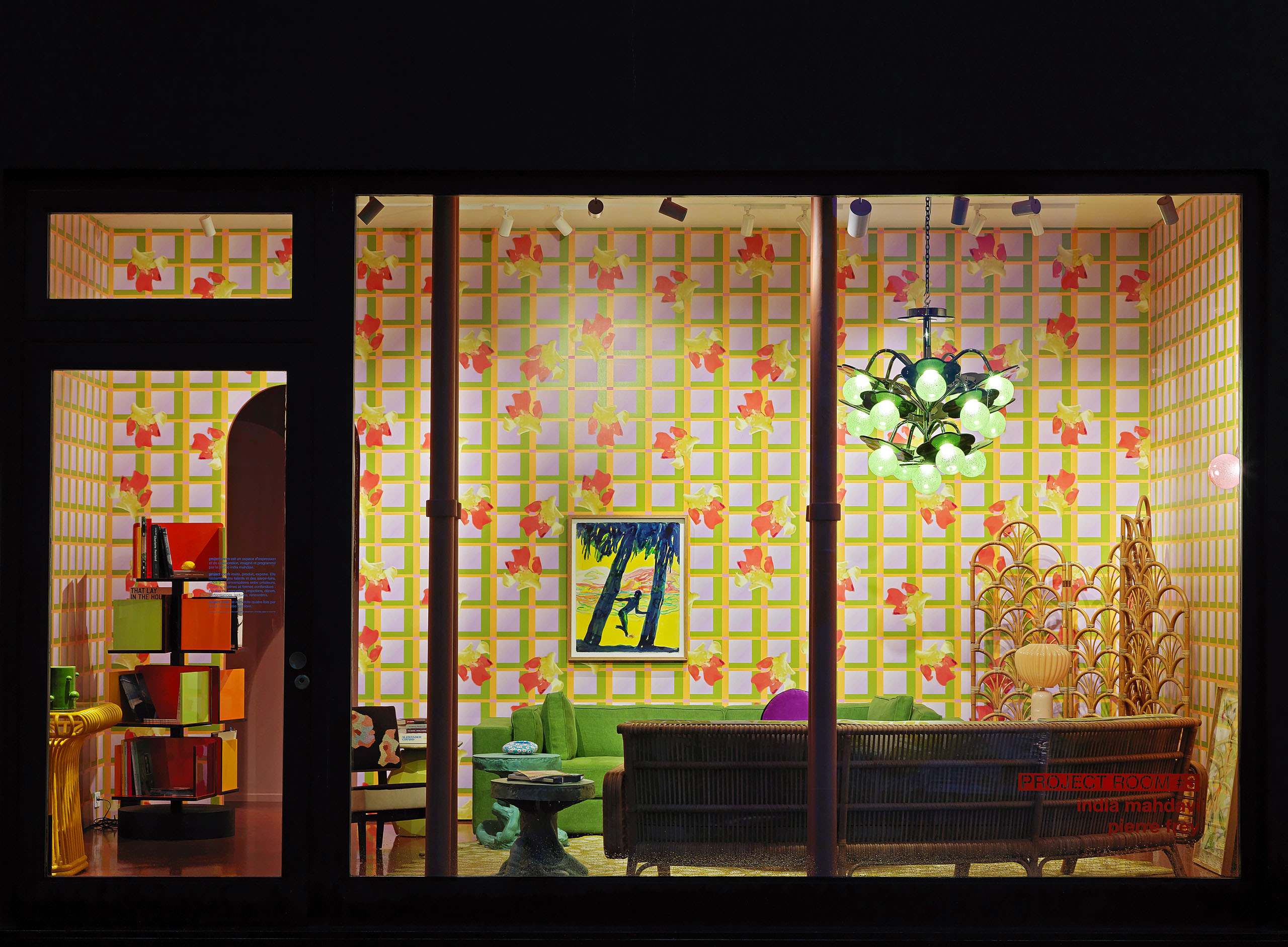
Her most recent work is Project Room #3, which demonstrates her inspiring range when compared to the desert minimalism of Siwa. For the project rooms, which regenerate four times a year, she creates a set in a space near her gallery on rue de Bellechasse. Three walls and a window give Mahdavi a sort of constraint, as if she is challenging herself to bottle her aesthetic, to define herself at varying times in her career. The project rooms allow Mahdavi to, in an homage to her deep creative debt to film, “project what I am feeling.” Here, her reliance on emotional designs and colour results in something that is almost quaint, like a grandmother’s basement, while remaining eminently tasteful.
Project Room #3. Photo by Thierry Depagne.
In this, the themes of sociality and the exultation of colour are encapsulated and shared with anyone who wants to come see. Within, a round straw marquetry table, a rattan and bronze screen, and Mahdavi’s signature sculptural Joker side tables stand in front of a neo-tartan backdrop, which incorporates a yellow similar to one of Pantone’s colour choices for 2021, Illuminating Yellow.
“I’ve wanted to showcase the living room in the shop front as if it were sectioned. And now I want it to be alive. This is why I’m imagining events at a time when events are not possible. The idea is to invite the people I like and admire au salon and offer them a safe space to initiate conversations.”
Mahdavi has been such a prophet when it comes to defining the colours of a time, and when asked about what colours define right now, she says, “I’m excited about colours that are not defined: the colours of uncertainty. Today nothing can be defined clearly—we can’t see what the future is made of. So, if I had to choose a colour that defines our times, it would be milky and watered-down. That’s why gradients have so much value these days.”
Despite this, the bright yellows of joy, of childhood, remain, revealing horizons through the foggy greys. For this constant freshening of material culture to usher in sunnier times, we have designers such as Mahdavi to thank for telling stories of what’s possible through her designs. “I will probably be remembered as someone who uses colour as her own language. The language of freedom. And that is fine with me.”